
Framer recently introduced rem units for font size. It's a great addition to the toolset and something the community has been asking for for a while. But rem can really be a destroyer of your designs and layouts if you're not careful. Before diving into how it can mess things up, we need to fully understand what rem is, how it behaves, and how it plays with Framer.
What is the rem unit?
In CSS, rem stands for “root em” — a unit of measurement that represents the font size of the root element. This means that 1remequals the font size of the <html> element, which, in most browsers, has a default value of 16px. Doing some pretty basic math, here's what we get:
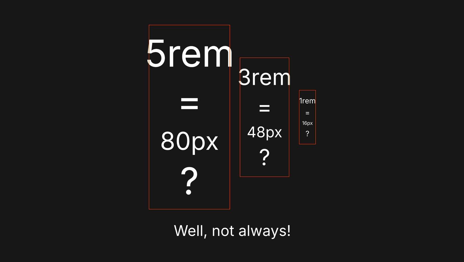
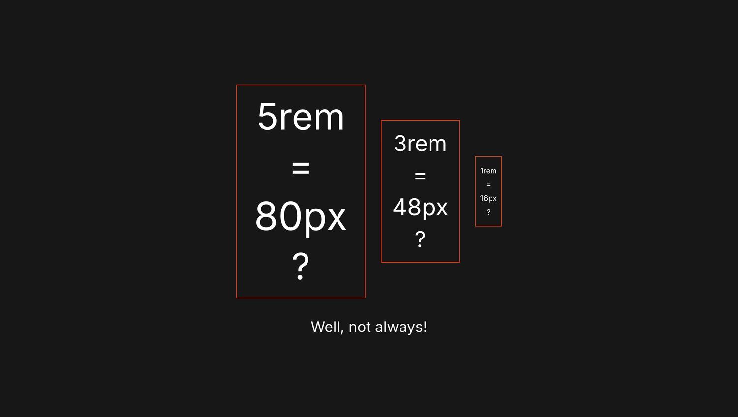
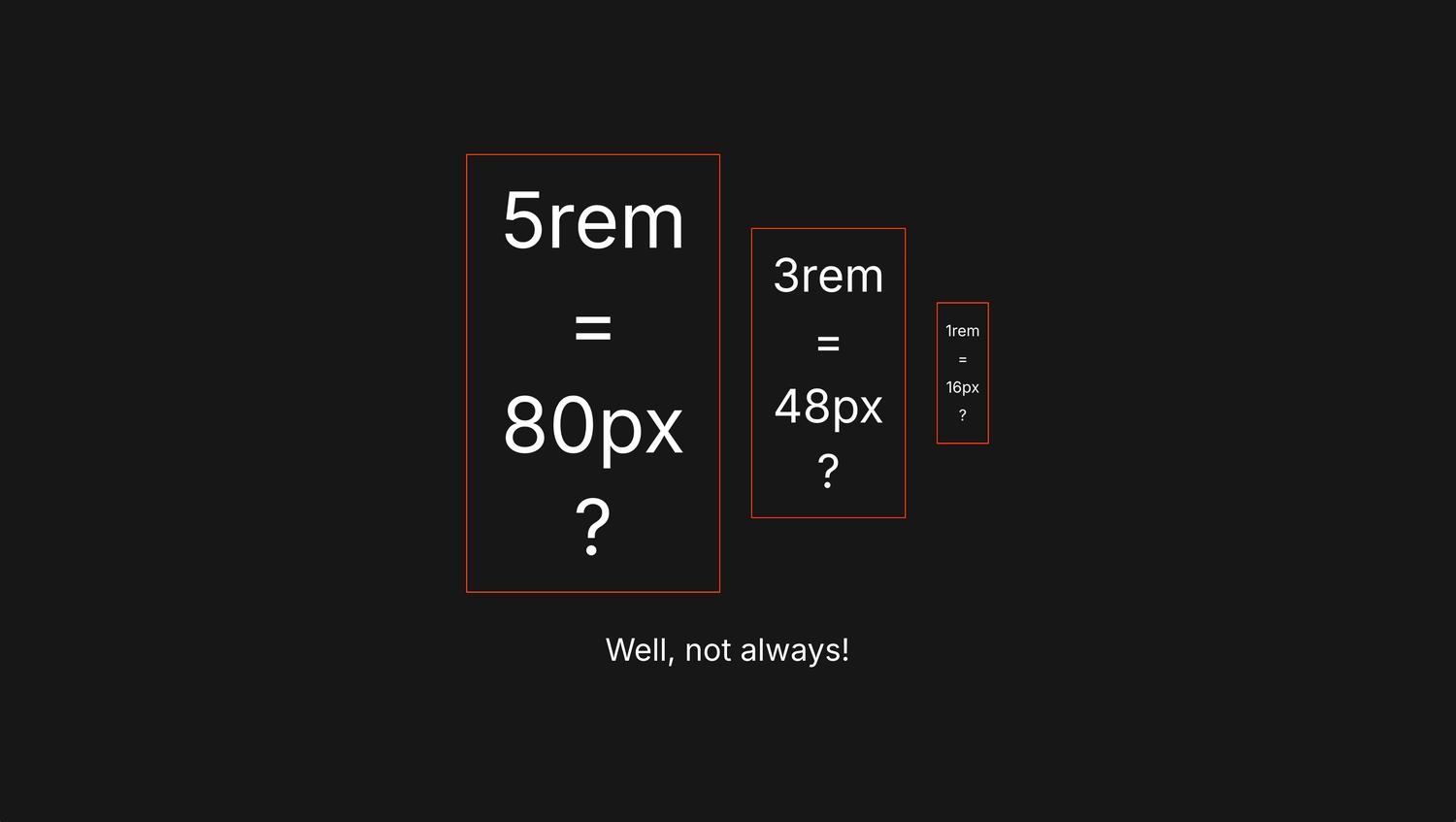
- 12px = 0.75rem
- 16px = 1rem (base)
- 20px = 1.25rem
- 24px = 1.5rem
- 32px = 2rem
- 48px = 3rem
- 64px = 4rem
- 80px = 5rem
Where is this default stored or defined?
Browsers use user agent stylesheets, which are internal styles applied before any of your own CSS. These styles include:
- default font-size on
<html>and other elements - default margin on
<body> - styles for built-in elements like
<input>,<button>, etc. - and many more
You can see these in the browser dev tools:
- Open Developer Tools (right-click > Inspect)
- In the Elements tab, select the
<html>element - Go to the “Computed” sub-tab and check the “Show all” checkbox
- Find the font-size property
Where is this injected?
The base pixel value of 1rem is applied at the <html> element level. The browser initializes rendering based on this value. So when you userem, your entire typography and spacing scale can shift depending on the user's browser settings. And that's where things can get unpredictable (and even ugly) because users can change their browser settings, especially font size.
Browser font size settings
So how can a user change the default font size — the actual pixel value of 1rem?
In Chrome, go to Settings > Appearance > Font size. The default is “Medium” (1rem = 16px). But there are two options below Medium and two above it. Let's say we're visually impaired and set the font size to “Very Large” (1rem = 24px). What happens to our typography in the design?
Well, if we use rem units, everything will scale, and possibly break if we didn't design with scaling in mind.
But wait, what if our designs use px for font size? In that case, the font won't scale. Our design is safe, yay. But the visually impaired user? Not so happy, because they can't read the text properly.
Now let's add Framer to the mix.
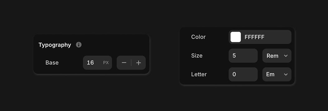
Font size rem units in Framer
In Framer, you can set the base pixel value of 1rem in the Layout Template under Typography. Then, you can use rem units in text layers instead of px. But let's walk through all the possible scenarios.
1. No layout template and rem in text layers
If you're not using Layout Templates (which you should, by the way), the rem value comes directly from the browser's settings.
- Browser settings:
1rem = 24px(Very Large) - Framer settings:
none - Text layer with
1remfont size renders as24px - Text layer with
5remfont size renders as120px
2. With layout template and rem in text layers
If you use a Layout Template and set the Base Typography to 15px, therem value is injected by Framer and overrides the browser setting.
- Browser settings:
1rem = 24px(Very Large) - Framer settings:
1rem = 15px - Text layer with
1remfont size renders as15px - Text layer with
5remfont size renders as75px
3.1 With layout template and rem in text layers (default setting: 16px)
Now things get weird. If you add a layout template but don't touch the Base Typography value (leave it at 16px), then the rem value still comes from the browser — Framer's setting is ignored.
- Browser settings:
1rem = 24px(Very Large) - Framer settings:
1rem = 16px(Ignored) - Text layer with
1remfont size renders as24px - Text layer with
5remfont size renders as120px
3.2 With layout template and rem in text layers (resetting to 16px)
On the other hand, if you add a layout template, click the plus button to change the Base Typography to 17px, then click minus to bring it back to 16px — now the rem value comes from Framer and overrides the browser.
- Browser settings:
1rem = 24px(Very Large) - Framer settings:
1rem = 16px - Text layer with
1remfont size renders as16px - Text layer with
5remfont size renders as80px
In both 3.1 and 3.2 we have 16px set in Framer, but the result is totally different. The only difference is that in 3.2, we interacted with the control. My spidey senses tell me that changing the value triggers Framer to override the browser default.
How can rem destroy design and layouts?
In scenarios 1 and 3.1, you're not in control of the final rendered font size — the user is. And if they've set their browser to “Very Large” (1rem = 24px), your text might break out of containers or get clipped if you're using overflow: hidden on the parent frame. In my screenshots, I set a fixed width on the orange-bordered parent frame to demonstrate this breakout.
Final thoughts
rem units were originally invented for accessibility — users couldn't zoom text sized with pixels. Framer's decision to override browser defaults (in scenarios 2 and 3.2) kind of goes against that original idea. But on the other hand, it helps keep your designs consistent.
If you're in scenario 1 or 3.1, your website is properly accessible, but you need to be really mindful of your design decisions. You have to account for the fact that the actual text size might be much larger for users with Large or Very Large font settings in their browser.